Cheap and Cheerful Scatter, Smother and Cover Renovation Tricks, Tips and the How to Do’s
Everybody likes to have a few tricks up their sleeves to do a “cheap and cheerful” cover-up and I wanted to share a few of the clever & creative (and often on a budget) ways that can quickly dress up a “blah and bland” space. As a designer, I’m always looking for ways to do something in different way or a way to put a unique spin on a product — and I’ve found one of the best ways to do that is to look at each product you see for what they are, and see what they could be, rather than for what the intended use might be only. Anytime I am looking at products, no matter what they are, I try to think of multiple uses for that single item. For example, Home Depot is one of my favorite design resources and just walking down the aisles I can gather inspiration that can spark limitless amounts of ideas for making a place look a bit better or a little bit brighter. Always keeping an open mind and being willing to try something different is one of the best pieces of advice I can give to anyone trying to spruce up a space.

If you’re not up to speed on my latest project, “Palm Beach Redo Numéro Deux”, you can get caught up by going to my Instagram (@danielledrollins) and clicking on the saved stories “Before & After #1” “Before & After #2” in highlight reels to see the progress of the redo. Make sure to keep checking back to follow all of my latest and upcoming projects from the beginning to end!

Problem #1: Pop Corn Ceilings
If you’ve been following my Instagram stories, YouTube channel and IGTV you know how “The Great Popcorn Ceiling Cover Up Capers” has been one of the funnier parts of this redo.
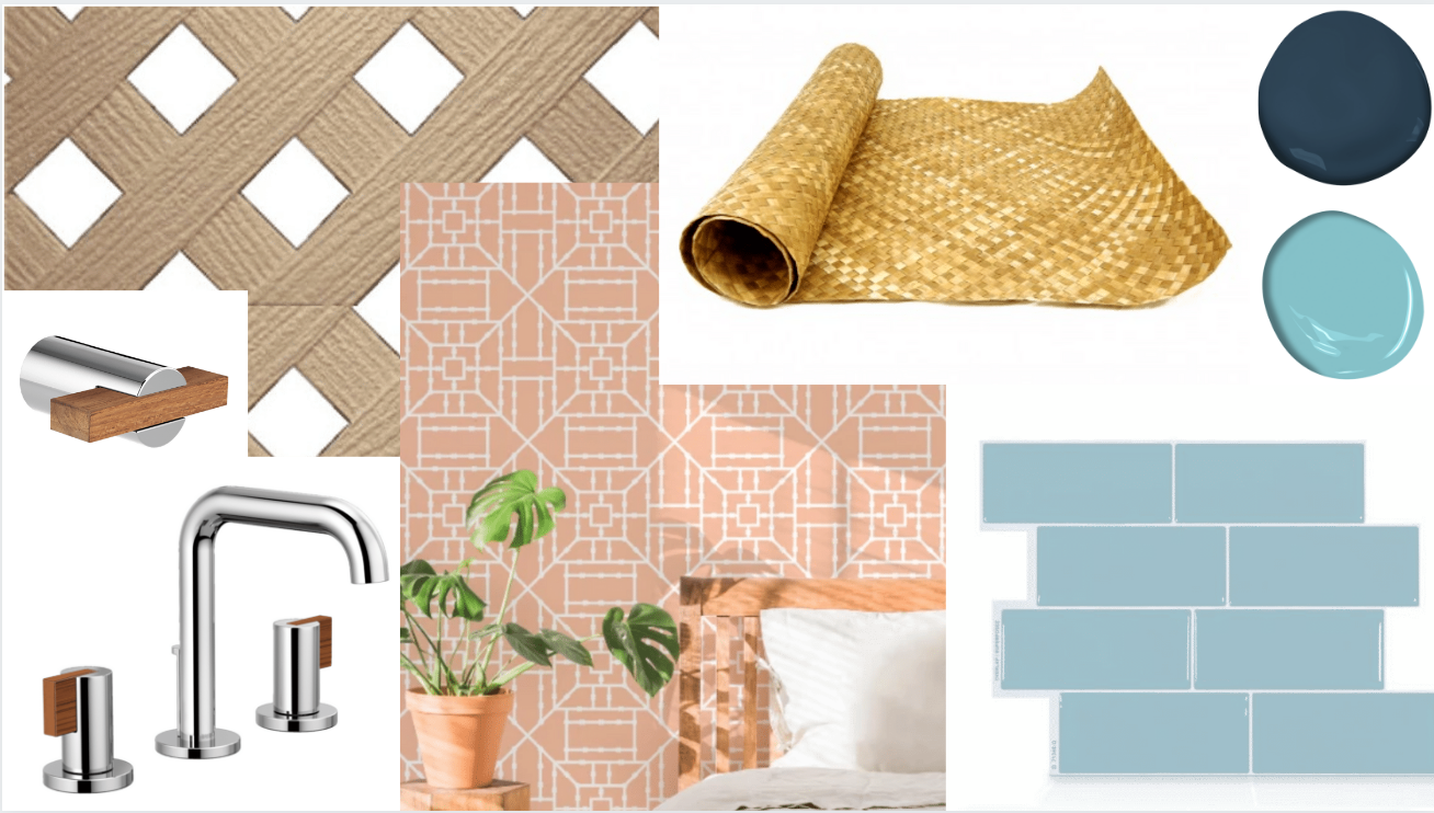
With this particular project, I knew the popcorn ceilings in a few rooms would be the first thing that had to go, but I didn’t have the time to do the traditional spray and scrape method of removing. For the living room ceiling, I was inspired by a visit to a tiki bar (yes, seriously). The rattan matting on the bar is where I drew my inspiration from and I decided why not use that on the ceiling? I thought it was a very Billy Baldwin meets the Golden Girls solution.
 I ended up purchasing a few roles of rattan matting from Forever Bamboo and got to work. To start, we put thin layers of compressed particle board up on ceiling, so it could be removed later. We used a spray adhesive to attach the rattan matting after coating it with a fire retardant. Having the whole ceiling matted without any variation still seemed a bit “blah” and unfinished so I decided to add furring strip boards in 4X4 sections across the ceiling and painted them in Benjamin Moore’s Ice Blue, which is the same color we painted the walls. This was the perfect solution to give the ceiling a more structured, refined and fully finished look. I would one hundred percent do this again on another project — even the ones with a perfectly good ceiling!


Moving into the master bedroom, I had a slightly different inspiration for the ceiling. On one of my Friday night Home Depot date nights, I saw the vinyl lattice and thought why not make the bedroom feel like a cabana? To execute my vision, I painted the ceiling in Benjamin Moore’s Pool Blue in a flat finish and then placed the vinyl lattice right on top. Mary Meade Evans, my go-to decorative painter based in Atlanta, flew to Palm Beach and worked her magic on the bedroom walls by adding differing width painted on stripes in Benjamin Moore’s Pool Blue on top of the existing white walls.


Problem #2: "Blah" Bathrooms
The problems in the bathrooms were outdated vanities, ugly faucets, yellow tiles, and the list of the lackluster went on and on....

In the guest bathroom, we painted the existing vanity Benjamin Moore’s “Gentleman’s Gray”, painted the tile floors and walls a crisp white with an epoxy paint and removed the outdated towel bar, toothpaste holder, etc. I purchased a large plank of teak & holly wood from a local marine supply retailer and had a custom made vanity countertop that sits perfectly right on top of existing counter.


The hole cut for the sink makes it look like an under mount sink rather than the all in one piece that it really is. By replacing the vanity faucet with a new teak and chrome faucet from BRIZO it made it just the most chic thing! A new shower arm and flange from BRIZO added another instant pop. By adding polished chrome towel bars, toilet paper holders and replacing the cabinet drawer pulls & robe hooks with coordinating BRIZO products, the bathroom took an instant upturn.


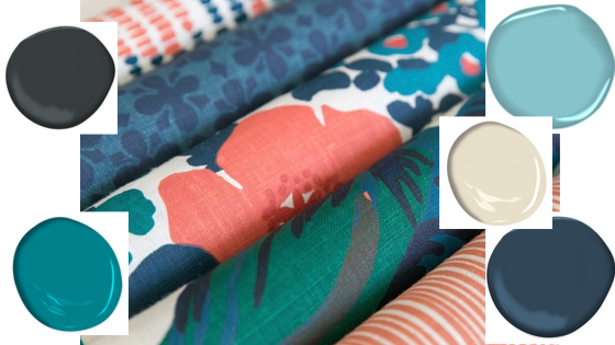
I am utterly obsessed with the BRIZO products from both a form and function perspective. A few other touches I added were new lighting fixtures, a teak curtain rod from West Elm repurposed into a shower curtain rod and a custom made shower curtain created from a favorite CW Stockwell fabric that we hung from the ceiling to create more height. In the master bathroom, I started by repainting the walls white because I just couldn’t live with butter-yellow walls. This bathroom was also in desperate need of updated fixtures which included a new 30” vanity in blue from Home Depot as well as a new counter top.


I used new BRIZO faucets, towel bar, robe hook, shower flange and shower head to keep up the subtle chrome and teak nautical theme. I also introduced a new glass shelf into the bathroom from Amazon which added more dimension, replacing the existing towel bar which was over the toilet (and required a pretty small towel!) The existing bathroom door has frosted glass which seems weird, so I used a 16” strip of woven rattan caning intended for chair seating placed over it. I also had another custom shower curtain created for this bathroom from CW Stockwell fabric and used a lucite curtain rod from Ballard Designs and attached it to the ceiling to create more height, just like we did in the guest bath.

Problem #3: Sad Sack Kitchen
My biggest issue in the kitchen was that it was a white box containing appliances that looked old, dull and outdated.

I wanted to give it some pizzazz. We painted the bottom cabinets, walls and inside of the upper cabinets in Benjamin Moore’s “Gentleman’s Gray”. To give the refrigerator a refresh we painted it with appliance paint and it looks brand new with a glossy finish.

The stainless steel sink looked flat, dull and dirty. Scrubbing it with Never Dull, one of my favorite finds from a boating obsessed friend, did the trick to bring it back to life. A new kitchen faucet from BRIZO that has a thick & chunky industrial feel fully updated the look.


I like to think of the hardware in a home as the jewelry. The final pop? We installed a removable tile from Smart Tiles in Metro Babe and I can’t tell you how much pizzazz just the tile backspash added to the place!!

It was the easiest thing to install, only taking a couple hours, almost like putting up stickers that you can clean!

And we used a removable wallpaper, “Bamboo Coral”, from the Mitchell Black Collection which I’m in love with on the DISHWASHER! When you’re doing a renovation, if you can get the backgrounds right, everything else falls into place. There’s a lot you can do with a little bit of imagination, a staple gun, and some elbow grease. I can’t wait to show you the final results of this project!


%20ways%20that%20can%20quickly%20dr...)