The Amazing Brian Patrick Flynn
Brian Patrick Flynn is a TV producer-turned-interior-designer. He is one of HGTV.com's leading writer-producer-designers and served as design producer for two seasons of the reality-competition series HGTV Design Star. Brian currently runs interior design businesses in Atlanta and Los Angeles, talks a million miles a minute, has a small dog that looks like a pig mixed with a deer, and describes his aesthetic as 'preppy, masculine, transitional and not beige'. This week's Gracious Living & Stylish Entertaining™ blog comes from Brian who shares his point of view on decorating. Take it away, Brian!!!
'OMG, I have so many opinions when it comes to design, it's like a nauseating run-on sentence certain to make everyone hate me in the face; however, my POV is based on experience rather than straight-up personal taste. This kinda sounds weird, but many times I come up with ideas for my projects, then google-image-search the bojangles out them to see if they've been done before---over and over again. If not, and I don't see a particular color scheme or an out-of-the-ordinary wall application duplicated a billion times on design blogs and on Pinterest, I pitch it to my clients with serious conviction. At first they're all like, 'How the hell am I going to say yes to something I cannot even see a picture of?' And then I am all like, 'Um, there is no picture of a coral-and-navy-toned formal entry with a giant pinwheel wall because one doesn't exist...duh? Now say yes and let's do this.'
Furthermore, and this will be extra interesting since he's one of Danielle's best friends, but I often ask myself, 'What would Miles Redd do?' in regard to creating jaw-dropping interiors that have a look and feel of their own. Time and time again I mention my love of designers Miles Redd and Betsy Burnham for having unique, tailored styles that are all parts classic and zero parts safe. Looking to those who inspire you, but still making things your own---to me at least---is what it's all about.
Okay so my two cents: I've got 12 design philosophies I commonly live by when designing interiors. They're not super obvious philosophies like 'Add Paint to Your Walls to Make Them Colorful' or something 100% based on my own likes and dislikes such as, 'I Never Use Suzani Because It's So Expected Right Now.', but more focused on making good decisions for the best use of your money and also for creating spaces that remain classic. [Says the guy who wants to do a tropical-toned 14-foot pinwheel wall in a formal entry.]'
THERE IS ALWAYS IKEA
Whether it's a penthouse or a penny-pinching project for a first-time howeowner, I always turn to IKEA for filler pieces to keep my budgets in check. How? Well, I go for their easily customizable items such as kitchen storage systems. In this little boy's room I did in Los Angeles, I was super limited on space for a desk, so instead I picked up red lacquer IKEA kitchen wall cabinets on clearance, then elevated them 6 inches above the floor for proper desk height, and had them fastened into the wall studs. KAZAM! Instant homework space with a custom look...without the custom price tag. Instead, I splurged on the York wallcovering and new white bamboo floors.
BIG MONEY FABRICS, LOW MONEY PIECES
Textiles are EVERYTHING for me in regard to interior design. One of my tricks is to find super affordable pieces with classic lines, then have them upholstered in high-end, classic fabrics. The stool for the workstation of my Los Angeles home is actually a $60 IKEA Henriksdal barstool upholstered in a Ralph Lauren tartan snagged from the Kravet showroom at ADAC. Neighbors always comment on the piece, and I just pretend I designed it from scratch. Oh well!
TEXTURE AND SHEEN VS. PAINT
If budgets allow for it, nine times out of ten I opt for texture, pattern and sheen on walls rather than paint. Why? I find that textures such as grasscloth, raffia, woven fabrics or even felt add instant warmth and dimension to a space. Plus, when a room is wrapped in texture, sheen or pattern, the walls often become the star, meaning you can go for a less-is-more approach in regard to furnishings. This high-rise I did in Atlanta is layered with a combination of metallic grasscloth in the great room, geometric wallpaper in the vestibules and a master bedroom covered in pinstripe men's suiting fabric. The client's neighbors still have no idea what to make of me. It's possible they think I am unwell...or on pills.
NOT SO KIDDIE KIDS' ROOMS
Short and sweet: kiddie kids' rooms become just that...and way too quickly. I try to play with color and pattern more than juvenile-centric prints and pieces in spaces for mini-humans. This allows a space to grow with a child so that you don't find yourself redoing Madison and Jamison's rooms at ages three, seven and eleven. Who the hell are Madison and Jamison? Hell if I know, but they sound cool [aka KEWL].
A TOUCH OF DAVID HICKS IS ALWAYS WELCOME
Regardless of my client's gender, I always try to mix masculine and feminine elements to keep a space as inviting to Jack and it is to Jill. My go-to designer/brand for fabrics and wallcoverings that are classic and masculine is David Hicks for Cole & Sons. This house I did in Sherman Oaks actually already had the office covered with a classic David Hicks pattern, so I updated the room around it. As of now, the space is pretty darn masculine; however, if I change the accents out from orange and turquoise to coral and mint, it can definitely become a bit more feminine.
NEW NEUTRALS VS. BEIGE
Beige makes me very, very sad. I get it, I get it: Beige and cream walls allow your cherished items to take center stage. Well, so does black and so does charcoal, right? My middle ground for color-phobes is to use new neutrals instead of beige and/or cream...just to dial up the not-so-safe factor. In fact, the living room of my own Atlanta home is greige. And by the time I threw in bursts of violet through accents, it definitely became a colorful space, but one that's not overwhelming. I think a lot of my designer friends are shocked at how neutral my Atlanta house is. Now my Los Angeles place, not so much. Unless you consider fire engine red and peacock blue neutral...which they totally are.
OFFICES THAT FEEL LIKE ROOMS
Offices, especially home offices for people who work primarily out of their own house, should not feel like offices. Since we are all so computer-centric now, I find that we tend to use our workspaces for way more than work, especially in regard to social media. That being said, I always focus on making offices feel more like decorated rooms rather then a space for a computer. In fact, this office I did for Kardashian Jenner Communications in Los Angeles is in a commercial building. The company president, TV star Kris Jenner, specifically wanted all of the commercial spaces to feel like an extension of her home which is packed with charcoal, grey and metallics. So I stuck with that palette, and now the office feels more like home.
GO BIG WITH PATTERN
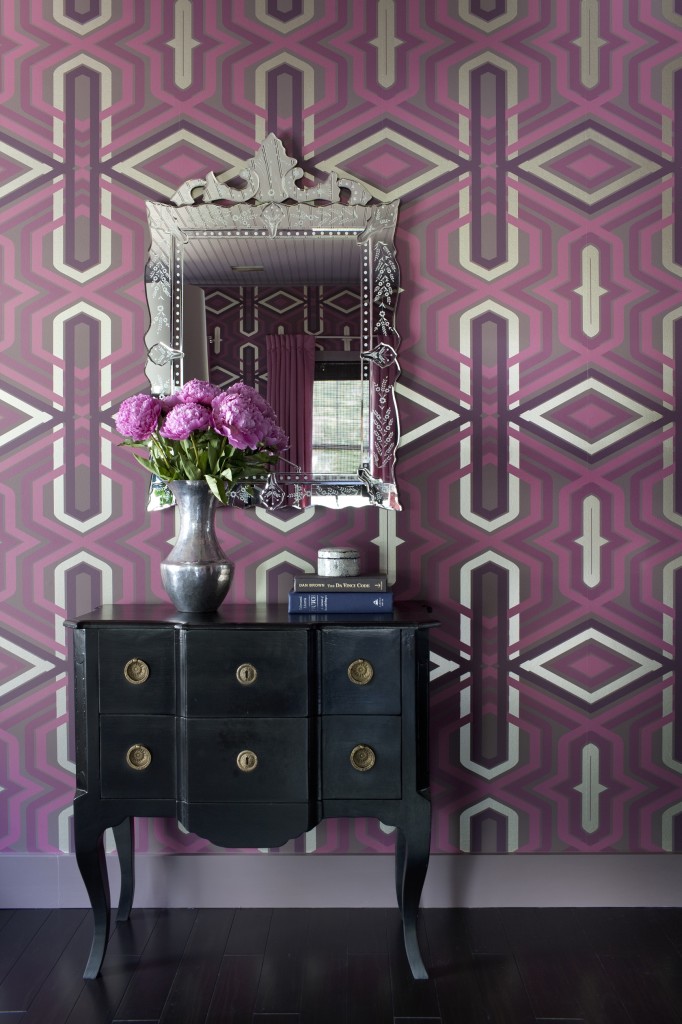
When it comes to wallpaper, I say if the space allows for it, go BIG with pattern. This is a huge help in boring rooms which are basically four walls of sheetrock with no architectural interest. By introducing pattern, BAM!, suddenly a lackluster space is PACKED with personality. Something I always recommend is seeing how many rolls your paper hanger suggests buying before committing to the wallpaper. Since there is so much waste involved with large repeats, it's likely you'll need a ton of product, and that gets super pricy...super quickly.
CUSTOM DOG FURNITURE
You know those ugly-ass dog beds that can be found at all retail stores? Ugh, those make me hate everyone. An eyesore piece such as a stupid doggie cushion can instantly disrupt the harmony of an otherwise gorgeous designer room. I suggest dropping off two or three yards of an indoor/outdoor fabric to a seamstress, then having a custom cushion made which coordinates well with your room. Or, if you're not too worried about budget, buy one of my custom dog sofas for nine million dollars! In my Los Angeles living room, I have a small camel back dog sofa made from Schumacher's Chevron Print which I had laminated to be doggie-friendly. It's so sturdy and so fun that friends actually prefer to sit in it rather than my human sofa. Well, they are usually drinking when they do this.
FLEA MARKET SOLUTIONS
Flea markets are everything when it comes to filling in the blanks of a room. Lately, I use flea markets for final touches which would otherwise require pricy custom or vintage purchases. In this bedroom, I grabbed a $10 traditional dresser, then retrofitted it as a teal-tastic nightstand with an integrated dog bed. And when I say 'I', that means my carpenter.
A TOUCH OF DIY
Do-it-yourself gets a bad rap, but I think it can act as comic relief in an otherwise polished space. In Manhattan, I had no budget left for side tables, so instead I used simple parsons tables with multi-colored electrical tape to give them a graphic, striped update. I think it looks fun. It's not trying to look high-end or polished, and that's why it works.
FLOOR TO CEILING TILE
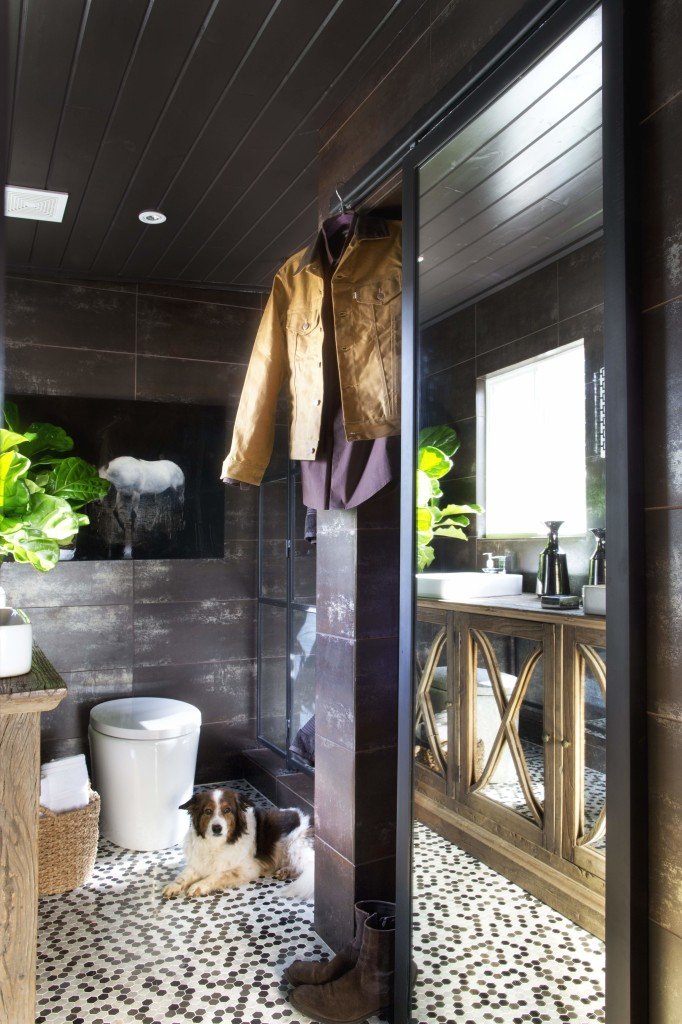
Bathroom design is tricky. Where do you start and stop with the wall tile? How do you decide if different species of stone will work harmoniously? Hell if I know, but what I do know is that you get much more bang for your buck when covering entire walls with tile. This drives the price up, but it adds instant architecture and results in a more finished look. Save up and go all the way, trust me!
That is all. Goodbye.
http://www.decordemon.com


